
We all knew that by using SVG and CSS keyframes animation, we can easily make simple lines and curves neatly appear to be written, as though a person is writing it (check out this awesome tutorial by Ian Yates if you are unfamiliar with it).
However, what if we want to animate our logos or signatures that are more than just simple curves with fixed stroke width? How could we animate complex logos like Coca-Cola or beautiful calligraphy? Turns out it’s not that hard, we simply have to animate each path using the dash-offset technique while clipping it with the original shape.
Demo
See the Pen Animating your SVG logo or signature that has variable stroke width: Demo by Yifei He (@hesyifei) on CodePen.
Preparation
Before we start, make sure to understand how basic SVG animation work. Again, I recommend this tutorial by Ian Yates before continuing if you are unfamiliar with SVG animation.
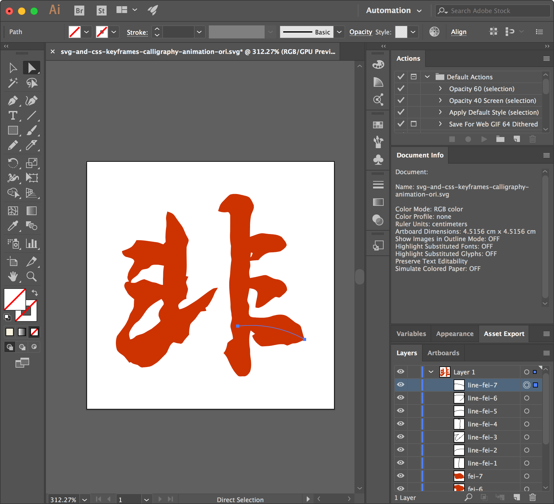
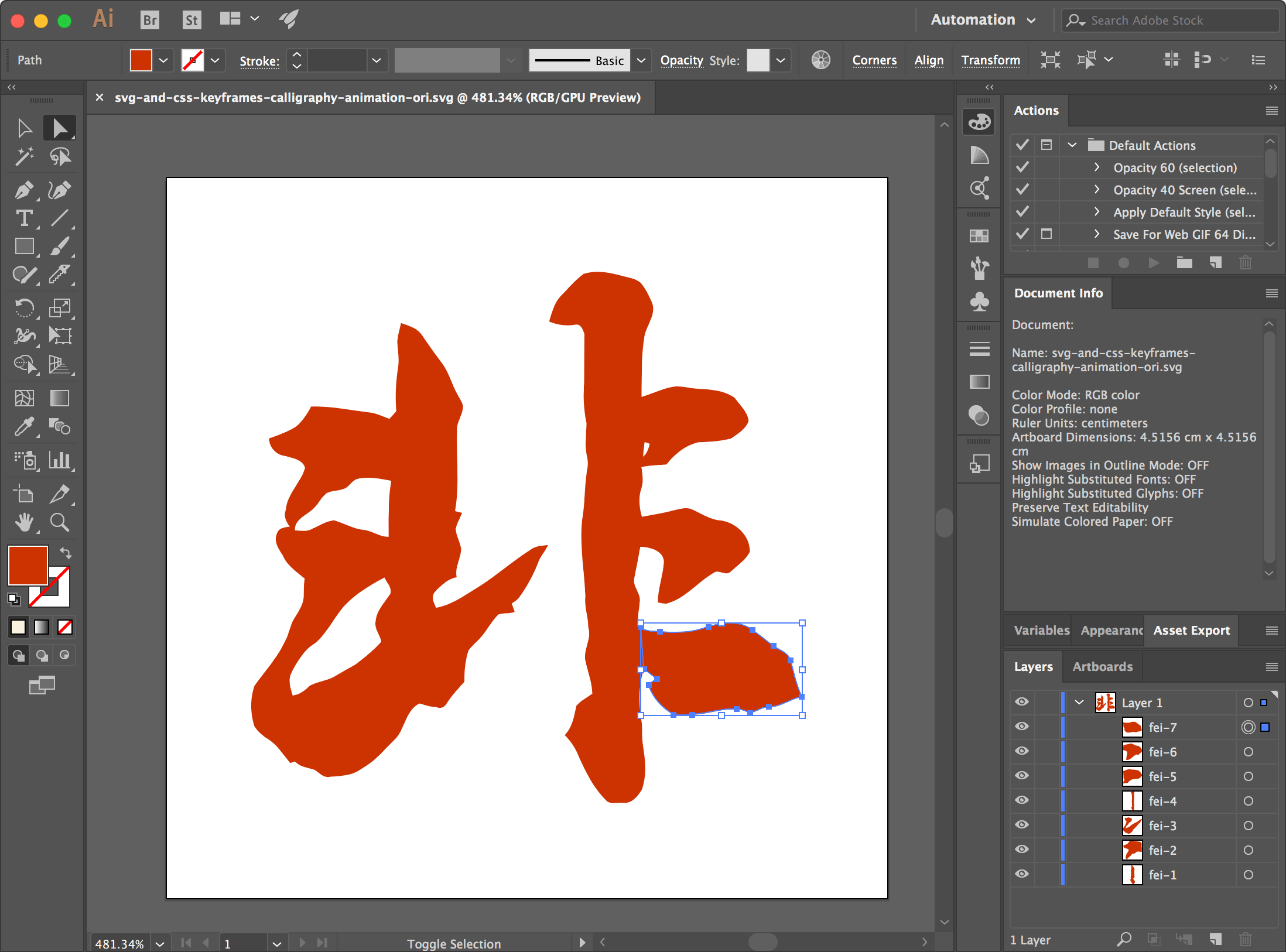
Now, divide your original SVG into strokes. In another word, each layer should only have one stroke inside. For example, if we are animating the Chinese character “非”, there should be 8 layers as it has 8 strokes. Similarly, for the character “t”, there should be 2 layers as it has 2 strokes.
Here we won’t go into detail here on how to divide the SVG into different parts as there are lots of tutorials on the Internet. Below are two examples of how I divided the character “非” into strokes using Adobe Illustrator. (Check out the tutorial on my Chinese blog if you want to learn more)
Now, our SVG content should be similar to this (and inside Adobe AI, this), where each closed path represent a stroke:
|
1 2 3 4 5 6 7 8 9 10 11 12 13 14 15 16 17 18 19 20 21 22 23 24 25 26 27 28 29 30 31 32 33 34 35 36 37 38 39 40 41 42 43 44 45 46 |
<?xml version="1.0" encoding="utf-8"?> <!-- Generator: Adobe Illustrator 21.0.2, SVG Export Plug-In . SVG Version: 6.00 Build 0) --> <svg version="1.1" id="Layer_1" xmlns="http://www.w3.org/2000/svg" xmlns:xlink="http://www.w3.org/1999/xlink" x="0px" y="0px" viewBox="0 0 128 128" style="enable-background:new 0 0 128 128;" xml:space="preserve"> <style type="text/css"> .st0{fill:#CC3300;} </style> <path id="fei-1" class="st0" d="M47.9,76.4c-0.4-0.9-1-2-0.2-2.9c1.1-1.1,2.3-2.3,3.8-2.6c-0.4-1.7,0.8-3.4,0.8-5.1 c-0.3-1.2-0.8-2.3-1-3.5c0.3-1,0.8-1.9,1.1-2.8c-0.4-0.1-0.8-0.2-1.2-0.3c0.9-4.9,0.1-10,0.4-15c0.2-1.2,1-2.3,1.1-3.6 c-0.1-0.7-0.6-1.3-0.9-1.9c-1.1-1.8-1.5-3.8-2.7-5.5c-1.3-1.7-2.5-3.5-3.7-5.2c-0.8-1.2-2.3-1.6-3.6-2.1c-0.2,1.1-0.6,2.2-0.7,3.3 c0.1,1.5,0.4,3.1,0.1,4.7c-0.4,2.5-0.5,5.1-0.3,7.7c-0.4,0.4-0.8,0.9-1.2,1.3c-0.1,0-0.1,0-0.2-0.1l0.4,11c0.1,0,0.1,0,0.2,0 c-0.6,3.3-0.5,6.7-0.5,10c-0.1,0-0.1,0-0.2,0L38.7,71c0,0,0,0,0.1,0c0.4,1,1.4,1.8,1.1,2.9c-1,1.5-2.4,2.9-2.6,4.8 c-0.3,1.4,0.8,2.4,1,3.7c0,0-0.1,0.1-0.1,0.1l6.8,10.8c0,0,0,0,0,0c1,0.3,2,0.6,3,0.7c0.7,0.4,1.4-0.1,1.8-0.6 c0.9-1.4,2-2.6,3.1-3.9c-0.1-1.8,0.1-3.6,0.6-5.4l-5.5-7.7C48,76.4,47.9,76.4,47.9,76.4z"/> <path id="fei-2" class="st0" d="M25.9,59c1-0.8,1.5-2.1,2.6-3c1.1-0.5,2.4-0.4,3.5-0.9c0.8-0.5,1.2-1.5,2.2-1.6 c1.9-0.4,3.8,0,5.7,0.3l-0.4-11c-1.2-0.5-2.4-1-3.7-1.1c-3.3-0.4-6.6-1.1-10-1c-0.7,1.3-1.5,2.5-2.6,3.5c-1.5,1-3.2,1.6-4.9,2.2 c0,1.6,1.3,2.9,2.8,3.1c1.3,0.4,3.1,0.6,3.6,2.1c-0.7,2.6-3.2,4.6-3.4,7.5c-0.4,1.1,0.1,2.1,0.7,3c0,0,0,0,0,0l0.9,0.5 C22.8,60.8,24.7,60,25.9,59z"/> <path id="fei-3" class="st0" d="M65.1,65.8c-3.6,2.2-6.7,5-10.2,7.2c-2.2,1.4-4.4,2.9-7,3.4l-9.7,5.9c0,0.1,0,0.1,0,0.2 c-1.4,1.5-3,2.8-4.6,4.1c-1.2,0.7-2.4,1.3-3.6,2c-1.4,0.9-3.1,0.9-4.6,1.7c-0.8,0.9-1.8,1.6-3,1.7c-0.4-1.3-0.9-2.8-0.2-4.2 c0.7-1.3,1.4-2.6,2.4-3.7c0.8-1,2.1-1.5,2.8-2.5c1.5-1.7,2.6-3.7,4-5.5c2-2.2,4.6-3.8,7.2-5.2l0.7-7.2c-1.6,0-2.9-1.1-4.5-1.2 c-1.8-0.2-3.4-1.2-5.1-1.7c-1.4,0.2-2.7,1-4,1.6c-0.9,0.4-2,0.2-2.9,0.2c0,0,0-0.1,0-0.1L21.9,62c-0.9,0.1-2,0.2-2.3,1.2 c-0.6,1.4,0.3,2.7,1,3.8c0.7,1.8,2.5,2.9,3.9,4.1c-0.2,1.1-0.1,2.1-0.2,3.2c-0.1,1.3-0.8,2.5-1.5,3.6c-1,1.4-1.1,3.1-1.9,4.6 c-1.3,2.9-3.5,5.2-5.3,7.7c-0.8,2.3-0.8,4.9,0,7.2c0.5,0.8,1.2,1.5,2,2c1.9,1,3,2.9,4.3,4.5c0.3-0.1,0.6-0.2,0.9-0.3 c0.9,1,2.2,1.1,3.4,1.5c0.9,0.5,1.7,1.6,2.9,1.2c1.9-0.1,3.9-0.2,5.5-1.4c2.2-1.2,3.9-3.2,5.7-5c2-1.8,1.9-5.2,4.5-6.5l8.6-9 c0-0.1,0.1-0.2,0.1-0.3c0.8-1.2,2-2,2.9-3.2c0.8-1.1,1.5-2.3,2.5-3.3c0.9-0.3,2-0.1,2.9-0.4c-0.2-0.5-0.4-1-0.5-1.5 c0.5-0.3,1-0.6,1.4-1.1c1.5-2,2.6-4.2,3.5-6.5c0.4-0.9,1.2-1.7,1.6-2.7C66.8,65.4,65.9,65.4,65.1,65.8z"/> <path id="fei-4" class="st0" d="M83.9,75.5c0.3-1.6-1.3-2.8-1-4.3c0.3-1.9,0.8-3.7,1.1-5.6c0,0,0,0,0,0l0.3-5.3 c-0.5-1.6-0.6-3.4-0.1-5c0.4-1.2,0.2-2.5,0-3.8c0,0,0,0,0.1,0l0.3-1.8c0,0,0,0-0.1,0.1c0-0.9,0.1-1.8,0.3-2.7c0,0,0,0,0,0l-0.5-8 c0,0-0.1,0-0.1,0c0-3.6-0.1-7.3,0.5-10.9c0.5-2.1,2.4-4.2,1.1-6.4c-0.5-1.1-1-2.1-1.8-3c-1-0.8-2.3-0.9-3.4-1.2 c-2.2-0.6-4.5-1-6.7-0.3c-1.4,1.1-2.6,2.4-3.8,3.7c-1.3,1.3-1.8,3-2.3,4.7c1.5,0.6,3,0.8,4.6,0.5c1-0.2,1.4,1,1.7,1.7 c0,2.8,0,5.6,0,8.4c-0.2,2.5-0.1,5,0.4,7.4c0,1.9-0.4,3.9,0.1,5.8c0.2,0.8,0.2,1.7,0,2.6c-0.4,2.9-0.4,5.9-0.9,8.8 c-0.4,4.5,0.4,8.9,0.6,13.4c-0.2,1.9,0.5,3.7,0.5,5.5c0.7,2.1-0.9,4-0.5,6c0.4,1.9,1.2,3.8,1.2,5.8c-0.9,0.7-2.1,1.2-2.8,2.1 c-0.4,1.8-0.7,3.8-2.1,5.2c0.9,0.9,1.7,2,2.3,3.2c1.3,3,2.7,6,5,8.3c0.7,0.8,1.9,0.4,2.8,0.4c1.7,0.3,2.8-1.1,3.5-2.4 c0.9-2.6,0.5-5.3,0.1-7.9c-0.3-1.5,0.1-3.1-0.3-4.6c-0.4-2.9-0.5-6,0.6-8.8c0,0,0,0,0,0l-0.5-7.5C83.2,78.5,83.9,76.9,83.9,75.5z"/> <path id="fei-5" class="st0" d="M85.8,47.3c-0.2,0.9-0.5,1.7-1.2,2.3l-0.3,1.8c1.4-0.3,2.9-0.3,4.4-0.5c1.5-1.8,3.4-3.4,5.7-3.9 c1.9-0.1,3.8-0.2,5.7-0.6c1.2-0.8,2.6-1.7,3.2-3.1c-0.2-1.7-1.6-2.9-2.5-4.2c-1.9-1.3-4.3-1.4-6.5-1.6c-1.3-0.1-2.6-0.5-4-0.4 c-2.1,0.2-4,1.2-6,1.8l0.5,8C85.2,47.1,85.5,47.2,85.8,47.3z"/> <path id="fei-6" class="st0" d="M88.3,68.2c-0.2,2.4-1.1,4.7-1.1,7.2c0.5,0.1,1,0.2,1.5,0.2c3.3-0.9,5.4-3.8,8.3-5.4 c0.9-0.8,2.2,0.7,3.1-0.3c1.1-1.1,2.6-2,3.3-3.4c0.1-2.9-2.7-5.4-5.5-5.6c-1.7-0.3-3.1-1.2-4.7-1.9c-1-0.4-2-0.1-3,0.1 c-1.9,0.5-3.9,0.9-5.9,1.2c0,0,0-0.1,0-0.1l-0.3,5.3C85.7,65.6,88.2,66.2,88.3,68.2z"/> <path id="fei-7" class="st0" d="M110.8,85.7c-0.4-1.4-2-1.9-3.1-2.6c-1.3-0.9-2.4-2-3.7-2.8c-2.3-1.7-5.3-1.3-7.9-0.6 c-2.7,1.1-5.7,1.2-8.6,0.9c-1.1-0.2-2.5,0.1-3.3-0.9c0,0,0,0,0-0.1l0.5,7.5c0.8,0.6,1.5,1.2,2.3,1.8c-0.5,0.3-1,0.7-1.5,1 c0.7,2.3,2.4,4.1,4.4,5.3c1.1,0.3,2.3,0,3.4,0c2.6-0.1,5.1-1.1,7.8-1c0.9-0.1,1.6,0.4,2.4,0.7c1.2-0.2,2.2-1,3.4-1.1 c2.1,0.1,3.8-1.4,5.8-1.8C111.8,90.1,111.3,87.9,110.8,85.7z"/> </svg> |
Then, we will need to add continuous paths to the SVG that represents the path that a pen would take if it were writing each stroke.
Our new SVG content should be similar to this (and inside Adobe AI, this):
|
1 2 3 4 5 6 7 8 9 10 11 12 13 14 15 16 17 18 19 20 21 |
<?xml version="1.0" encoding="utf-8"?> <!-- Generator: Adobe Illustrator 21.0.2, SVG Export Plug-In . SVG Version: 6.00 Build 0) --> <svg version="1.1" id="Layer_1" xmlns="http://www.w3.org/2000/svg" xmlns:xlink="http://www.w3.org/1999/xlink" x="0px" y="0px" viewBox="0 0 128 128" style="enable-background:new 0 0 128 128;" xml:space="preserve"> <style type="text/css"> .st0{fill:#CC3300;} .st1{fill:none;} </style> <path id="line-fei-1" class="st1" d="M49.9,21.9C47,36,44.9,50.3,43.6,64.6c-0.6,6.5-1.1,13.2,0.7,19.6c1,3.4,3,7,6.4,7.9"/> <path id="line-fei-2" class="st1" d="M13.8,56.9c3.8-0.8,6.5-4.3,10-5.9c1.9-0.9,4.1-1.2,6.2-1.5c7.2-1,14.4-2,21.6-0.8"/> <path id="line-fei-3" class="st1" d="M13.5,70c5.1,0.8,10.3,0.5,15.2-0.9c3.1-0.9,6.2-2.2,9.4-2.3c-7.8,3.3-13,10.8-16.7,18.4 c-1.1,2.3-2.1,4.7-2.2,7.3c0,2.6,1.1,5.3,3.5,6.4c1.7,0.8,3.8,0.6,5.6-0.2c1.8-0.8,3.3-2,4.8-3.2c2.7-2.2,5.4-4.4,8-6.6 c0.7-0.6,1.5-1.2,2.2-1.8c0.9-0.7,1.8-1.5,2.7-2.2c7.6-6.3,14.8-13,21.7-20"/> <path id="line-fei-4" class="st1" d="M62.8,19.4c2.4,0.3,4.9,0,7.3,0c2.4,0,5,0.5,6.9,2.1c2.9,2.6,3,7,2.9,10.9 c-0.6,17.3-0.7,34.7-0.4,52c0.1,2.5,0.1,5-0.2,7.5c-0.6,4.9-2.5,9.4-4.3,14"/> <path id="line-fei-5" class="st1" d="M77.7,45.4c1.9-1.4,4.2-1.9,6.5-2.3c2.9-0.5,5.8-1.1,8.7-1.1c2.9,0,5.9,0.4,8.5,1.8"/> <path id="line-fei-6" class="st1" d="M76.4,64.1c5.3-0.8,10.7-1.1,16.1-1c1.2,0,2.6,0.1,3.4,1.1c0.6,0.8,0.6,2,0.1,3s-1.2,1.7-2,2.4 c-2.2,2-4.4,4-6.5,6"/> <path id="line-fei-7" class="st1" d="M78,85.1c11.9-1.4,24.1,1,34.6,6.8"/> // ...The rest is same as above... </svg> |
Animation
Normally, the standard dash animation technique works as follows:
See the Pen xzBMEN by Yifei He (@hesyifei) on CodePen.
As we can see, in above example, we are simply animating the “lines”. But what we really want is to use these paths as indicators to animate the corresponding shapes.
So, let’s first wrap the actual shapes inside clipPath.
|
1 2 3 4 5 6 7 8 9 10 11 12 13 14 15 16 17 18 19 20 21 22 23 24 25 26 27 28 29 30 31 32 33 34 35 36 37 38 39 40 41 42 43 44 45 46 47 48 49 50 51 52 53 54 55 56 57 58 59 60 61 62 63 64 65 66 67 68 |
<svg id="calligraphy-content" viewBox="0 0 128 128"> <path class="pen line-fei-1" d="M49.9,21.9C47,36,44.9,50.3,43.6,64.6c-0.6,6.5-1.1,13.2,0.7,19.6c1,3.4,3,7,6.4,7.9"/> <path class="pen line-fei-2" d="M13.8,56.9c3.8-0.8,6.5-4.3,10-5.9c1.9-0.9,4.1-1.2,6.2-1.5c7.2-1,14.4-2,21.6-0.8"/> <path class="pen line-fei-3" d="M13.5,70c5.1,0.8,10.3,0.5,15.2-0.9c3.1-0.9,6.2-2.2,9.4-2.3c-7.8,3.3-13,10.8-16.7,18.4 c-1.1,2.3-2.1,4.7-2.2,7.3c0,2.6,1.1,5.3,3.5,6.4c1.7,0.8,3.8,0.6,5.6-0.2c1.8-0.8,3.3-2,4.8-3.2c2.7-2.2,5.4-4.4,8-6.6 c0.7-0.6,1.5-1.2,2.2-1.8c0.9-0.7,1.8-1.5,2.7-2.2c7.6-6.3,14.8-13,21.7-20"/> <path class="pen line-fei-4" d="M62.8,19.4c2.4,0.3,4.9,0,7.3,0c2.4,0,5,0.5,6.9,2.1c2.9,2.6,3,7,2.9,10.9 c-0.6,17.3-0.7,34.7-0.4,52c0.1,2.5,0.1,5-0.2,7.5c-0.6,4.9-2.5,9.4-4.3,14"/> <path class="pen line-fei-5" d="M77.7,45.4c1.9-1.4,4.2-1.9,6.5-2.3c2.9-0.5,5.8-1.1,8.7-1.1c2.9,0,5.9,0.4,8.5,1.8"/> <path class="pen line-fei-6" d="M76.4,64.1c5.3-0.8,10.7-1.1,16.1-1c1.2,0,2.6,0.1,3.4,1.1c0.6,0.8,0.6,2,0.1,3s-1.2,1.7-2,2.4 c-2.2,2-4.4,4-6.5,6"/> <path class="pen line-fei-7" d="M78,85.1c11.9-1.4,24.1,1,34.6,6.8"/> <defs> <clipPath id="fei-1"> <path d="M47.9,76.4c-0.4-0.9-1-2-0.2-2.9c1.1-1.1,2.3-2.3,3.8-2.6c-0.4-1.7,0.8-3.4,0.8-5.1 c-0.3-1.2-0.8-2.3-1-3.5c0.3-1,0.8-1.9,1.1-2.8c-0.4-0.1-0.8-0.2-1.2-0.3c0.9-4.9,0.1-10,0.4-15c0.2-1.2,1-2.3,1.1-3.6 c-0.1-0.7-0.6-1.3-0.9-1.9c-1.1-1.8-1.5-3.8-2.7-5.5c-1.3-1.7-2.5-3.5-3.7-5.2c-0.8-1.2-2.3-1.6-3.6-2.1c-0.2,1.1-0.6,2.2-0.7,3.3 c0.1,1.5,0.4,3.1,0.1,4.7c-0.4,2.5-0.5,5.1-0.3,7.7c-0.4,0.4-0.8,0.9-1.2,1.3c-0.1,0-0.1,0-0.2-0.1l0.4,11c0.1,0,0.1,0,0.2,0 c-0.6,3.3-0.5,6.7-0.5,10c-0.1,0-0.1,0-0.2,0L38.7,71c0,0,0,0,0.1,0c0.4,1,1.4,1.8,1.1,2.9c-1,1.5-2.4,2.9-2.6,4.8 c-0.3,1.4,0.8,2.4,1,3.7c0,0-0.1,0.1-0.1,0.1l6.8,10.8c0,0,0,0,0,0c1,0.3,2,0.6,3,0.7c0.7,0.4,1.4-0.1,1.8-0.6 c0.9-1.4,2-2.6,3.1-3.9c-0.1-1.8,0.1-3.6,0.6-5.4l-5.5-7.7C48,76.4,47.9,76.4,47.9,76.4z"/> </clipPath> <clipPath id="fei-2"> <path d="M25.9,59c1-0.8,1.5-2.1,2.6-3c1.1-0.5,2.4-0.4,3.5-0.9c0.8-0.5,1.2-1.5,2.2-1.6 c1.9-0.4,3.8,0,5.7,0.3l-0.4-11c-1.2-0.5-2.4-1-3.7-1.1c-3.3-0.4-6.6-1.1-10-1c-0.7,1.3-1.5,2.5-2.6,3.5c-1.5,1-3.2,1.6-4.9,2.2 c0,1.6,1.3,2.9,2.8,3.1c1.3,0.4,3.1,0.6,3.6,2.1c-0.7,2.6-3.2,4.6-3.4,7.5c-0.4,1.1,0.1,2.1,0.7,3c0,0,0,0,0,0l0.9,0.5 C22.8,60.8,24.7,60,25.9,59z"/> </clipPath> <clipPath id="fei-3"> <path d="M65.1,65.8c-3.6,2.2-6.7,5-10.2,7.2c-2.2,1.4-4.4,2.9-7,3.4l-9.7,5.9c0,0.1,0,0.1,0,0.2 c-1.4,1.5-3,2.8-4.6,4.1c-1.2,0.7-2.4,1.3-3.6,2c-1.4,0.9-3.1,0.9-4.6,1.7c-0.8,0.9-1.8,1.6-3,1.7c-0.4-1.3-0.9-2.8-0.2-4.2 c0.7-1.3,1.4-2.6,2.4-3.7c0.8-1,2.1-1.5,2.8-2.5c1.5-1.7,2.6-3.7,4-5.5c2-2.2,4.6-3.8,7.2-5.2l0.7-7.2c-1.6,0-2.9-1.1-4.5-1.2 c-1.8-0.2-3.4-1.2-5.1-1.7c-1.4,0.2-2.7,1-4,1.6c-0.9,0.4-2,0.2-2.9,0.2c0,0,0-0.1,0-0.1L21.9,62c-0.9,0.1-2,0.2-2.3,1.2 c-0.6,1.4,0.3,2.7,1,3.8c0.7,1.8,2.5,2.9,3.9,4.1c-0.2,1.1-0.1,2.1-0.2,3.2c-0.1,1.3-0.8,2.5-1.5,3.6c-1,1.4-1.1,3.1-1.9,4.6 c-1.3,2.9-3.5,5.2-5.3,7.7c-0.8,2.3-0.8,4.9,0,7.2c0.5,0.8,1.2,1.5,2,2c1.9,1,3,2.9,4.3,4.5c0.3-0.1,0.6-0.2,0.9-0.3 c0.9,1,2.2,1.1,3.4,1.5c0.9,0.5,1.7,1.6,2.9,1.2c1.9-0.1,3.9-0.2,5.5-1.4c2.2-1.2,3.9-3.2,5.7-5c2-1.8,1.9-5.2,4.5-6.5l8.6-9 c0-0.1,0.1-0.2,0.1-0.3c0.8-1.2,2-2,2.9-3.2c0.8-1.1,1.5-2.3,2.5-3.3c0.9-0.3,2-0.1,2.9-0.4c-0.2-0.5-0.4-1-0.5-1.5 c0.5-0.3,1-0.6,1.4-1.1c1.5-2,2.6-4.2,3.5-6.5c0.4-0.9,1.2-1.7,1.6-2.7C66.8,65.4,65.9,65.4,65.1,65.8z"/> </clipPath> <clipPath id="fei-4"> <path id="fei-4" class="st0" d="M83.9,75.5c0.3-1.6-1.3-2.8-1-4.3c0.3-1.9,0.8-3.7,1.1-5.6c0,0,0,0,0,0l0.3-5.3 c-0.5-1.6-0.6-3.4-0.1-5c0.4-1.2,0.2-2.5,0-3.8c0,0,0,0,0.1,0l0.3-1.8c0,0,0,0-0.1,0.1c0-0.9,0.1-1.8,0.3-2.7c0,0,0,0,0,0l-0.5-8 c0,0-0.1,0-0.1,0c0-3.6-0.1-7.3,0.5-10.9c0.5-2.1,2.4-4.2,1.1-6.4c-0.5-1.1-1-2.1-1.8-3c-1-0.8-2.3-0.9-3.4-1.2 c-2.2-0.6-4.5-1-6.7-0.3c-1.4,1.1-2.6,2.4-3.8,3.7c-1.3,1.3-1.8,3-2.3,4.7c1.5,0.6,3,0.8,4.6,0.5c1-0.2,1.4,1,1.7,1.7 c0,2.8,0,5.6,0,8.4c-0.2,2.5-0.1,5,0.4,7.4c0,1.9-0.4,3.9,0.1,5.8c0.2,0.8,0.2,1.7,0,2.6c-0.4,2.9-0.4,5.9-0.9,8.8 c-0.4,4.5,0.4,8.9,0.6,13.4c-0.2,1.9,0.5,3.7,0.5,5.5c0.7,2.1-0.9,4-0.5,6c0.4,1.9,1.2,3.8,1.2,5.8c-0.9,0.7-2.1,1.2-2.8,2.1 c-0.4,1.8-0.7,3.8-2.1,5.2c0.9,0.9,1.7,2,2.3,3.2c1.3,3,2.7,6,5,8.3c0.7,0.8,1.9,0.4,2.8,0.4c1.7,0.3,2.8-1.1,3.5-2.4 c0.9-2.6,0.5-5.3,0.1-7.9c-0.3-1.5,0.1-3.1-0.3-4.6c-0.4-2.9-0.5-6,0.6-8.8c0,0,0,0,0,0l-0.5-7.5C83.2,78.5,83.9,76.9,83.9,75.5z"/> </clipPath> <clipPath id="fei-5"> <path id="fei-5" class="st0" d="M85.8,47.3c-0.2,0.9-0.5,1.7-1.2,2.3l-0.3,1.8c1.4-0.3,2.9-0.3,4.4-0.5c1.5-1.8,3.4-3.4,5.7-3.9 c1.9-0.1,3.8-0.2,5.7-0.6c1.2-0.8,2.6-1.7,3.2-3.1c-0.2-1.7-1.6-2.9-2.5-4.2c-1.9-1.3-4.3-1.4-6.5-1.6c-1.3-0.1-2.6-0.5-4-0.4 c-2.1,0.2-4,1.2-6,1.8l0.5,8C85.2,47.1,85.5,47.2,85.8,47.3z"/> </clipPath> <clipPath id="fei-6"> <path id="fei-6" class="st0" d="M88.3,68.2c-0.2,2.4-1.1,4.7-1.1,7.2c0.5,0.1,1,0.2,1.5,0.2c3.3-0.9,5.4-3.8,8.3-5.4 c0.9-0.8,2.2,0.7,3.1-0.3c1.1-1.1,2.6-2,3.3-3.4c0.1-2.9-2.7-5.4-5.5-5.6c-1.7-0.3-3.1-1.2-4.7-1.9c-1-0.4-2-0.1-3,0.1 c-1.9,0.5-3.9,0.9-5.9,1.2c0,0,0-0.1,0-0.1l-0.3,5.3C85.7,65.6,88.2,66.2,88.3,68.2z"/> </clipPath> <clipPath id="fei-7"> <path id="fei-7" class="st0" d="M110.8,85.7c-0.4-1.4-2-1.9-3.1-2.6c-1.3-0.9-2.4-2-3.7-2.8c-2.3-1.7-5.3-1.3-7.9-0.6 c-2.7,1.1-5.7,1.2-8.6,0.9c-1.1-0.2-2.5,0.1-3.3-0.9c0,0,0,0,0-0.1l0.5,7.5c0.8,0.6,1.5,1.2,2.3,1.8c-0.5,0.3-1,0.7-1.5,1 c0.7,2.3,2.4,4.1,4.4,5.3c1.1,0.3,2.3,0,3.4,0c2.6-0.1,5.1-1.1,7.8-1c0.9-0.1,1.6,0.4,2.4,0.7c1.2-0.2,2.2-1,3.4-1.1 c2.1,0.1,3.8-1.4,5.8-1.8C111.8,90.1,111.3,87.9,110.8,85.7z"/> </clipPath> </defs> </svg> |
Then we just have to simply add a clip-path: url(#clippath_id); to each .line- class, and then change the stroke-width of .pen to approrpiate value.
|
1 2 3 4 5 6 7 8 9 10 11 12 13 14 15 16 17 18 19 20 21 |
.pen { // ... stroke-width: 12; // You should test and find the best stroke-width // ... } .line-fei-1 { clip-path: url(#fei-1); stroke-dasharray: 75; animation-name: draw-fei-1; } .line-fei-2 { clip-path: url(#fei-2); stroke-dasharray: 40; animation-name: draw-fei-2; } // etc... |
And that’s it! 😉
See the Pen Animating your SVG logo or signature that has variable stroke width: Clip paths animation by Yifei He (@hesyifei) on CodePen.
Using LESS to simplify the code
The code above already seems long and repeated, let alone adding browser prefix for animation and @keyframes. So below is a piece of LESS code that I wrote to make the whole thing simpler. Feel free to leave a comment if you have even better method!
|
1 2 3 4 5 6 7 8 9 10 11 12 13 14 15 16 17 18 19 20 21 22 23 24 25 26 27 28 29 |
.keyframes(@name, @rules) { @-webkit-keyframes @name { @rules(); } @-moz-keyframes @name { @rules(); } @-ms-keyframes @name { @rules(); } @-o-keyframes @name { @rules(); } @keyframes @name { @rules(); } } .animation (@name, @duration: 300ms, @ease: ease) { -webkit-animation: @name @duration @ease; -moz-animation: @name @duration @ease; -ms-animation: @name @duration @ease; animation: @name @duration @ease; } .do-calligraphy-animation(@name, @strokeDasharray, @startPct, @endPct, @timingFunction: @animation-timing-function) { .line-@{name} { clip-path: url("#@{name}"); stroke-dasharray: @strokeDasharray; .animation(~'draw-@{name}', @animation-duration, @timingFunction); } .keyframes(~'draw-@{name}', { 0%, @{startPct} { stroke-dashoffset: @strokeDasharray; } @{endPct} { stroke-dashoffset: 0; } }); } |
|
1 2 3 4 5 6 7 8 9 10 11 12 13 14 15 16 17 18 19 20 |
// Set your animation-duration and animation-timing-function here @animation-duration: 5s; @animation-timing-function: ease; .pen { fill: none; stroke: rgb(199, 182, 160); stroke-width: 20; stroke-linecap: round; stroke-linejoin: round; stroke-dashoffset: 0; } .do-calligraphy-animation(fei-1, 75, 0%, 10%); .do-calligraphy-animation(fei-2, 40, 10%, 20%); .do-calligraphy-animation(fei-3, 124, 20%, 30%); .do-calligraphy-animation(fei-4, 101, 30%, 40%); .do-calligraphy-animation(fei-5, 25, 40%, 50%); .do-calligraphy-animation(fei-6, 35, 50%, 60%); .do-calligraphy-animation(fei-7, 36, 60%, 100%); |
See the Pen Animating your SVG logo or signature that has variable stroke width: Using LESS to simplify code by Yifei He (@hesyifei) on CodePen.
References
- Sign on the Dotted Line: Animating Your Own SVG Signature
- How to animate handwriting text on the web page using SVG?
- GIFs in this article are recorded using LICEcap and converted to videos according to “Optimizing Animated GIFs by Converting to HTML5 Video”